ABOUT
Perzona is a SaaS brand from Mexico that crafts meticulous, beautiful, and effective HR, payroll, and credit solutions. Its goal is simple: to remove complexity while blending accuracy with elegance. By eliminating chaos and ensuring everything is done right from the start, Perzona sets new industry standards. Through the integration of HR, payroll, and innovative credit solutions, the company provides SMEs with well-crafted, insightful, and effective tools. The focus is always on creating the best user experience in the Mexican market—an experience that is not only user-friendly but intuitive, seamless, and fully integrated. Looking forward, Perzona aims to expand across LATAM, establishing itself as a benchmark in simplicity and efficiency.
STRATEGY
Repository. Project notes for this section will return here.
LOGO & TYPOGRAPHY
Repository. Project notes for this section will return here.
MOTION BEHAVIOR
Repository. Project notes for this section will return here.
COLORS
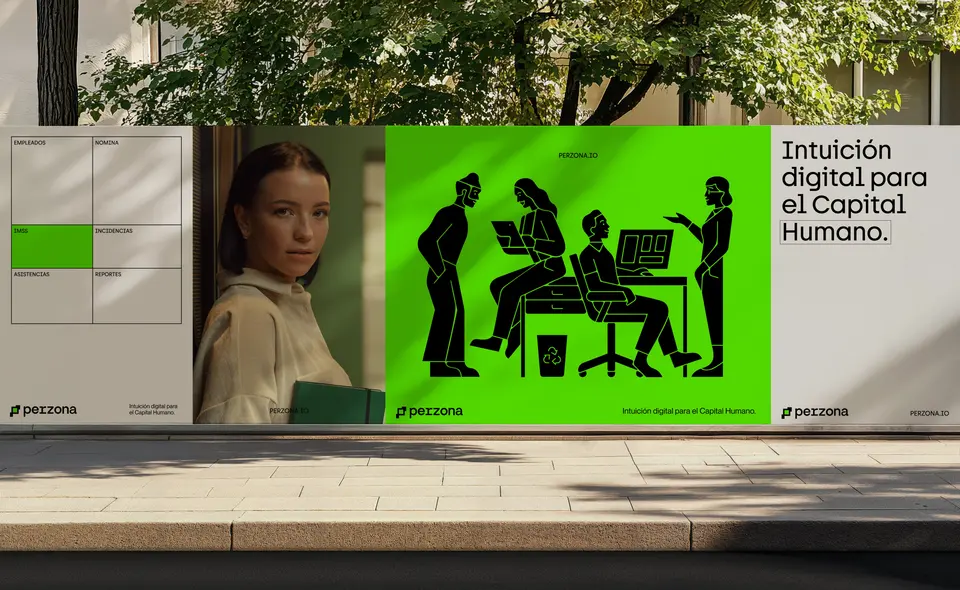
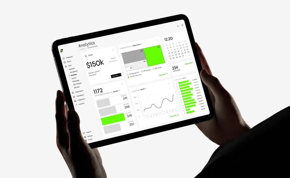
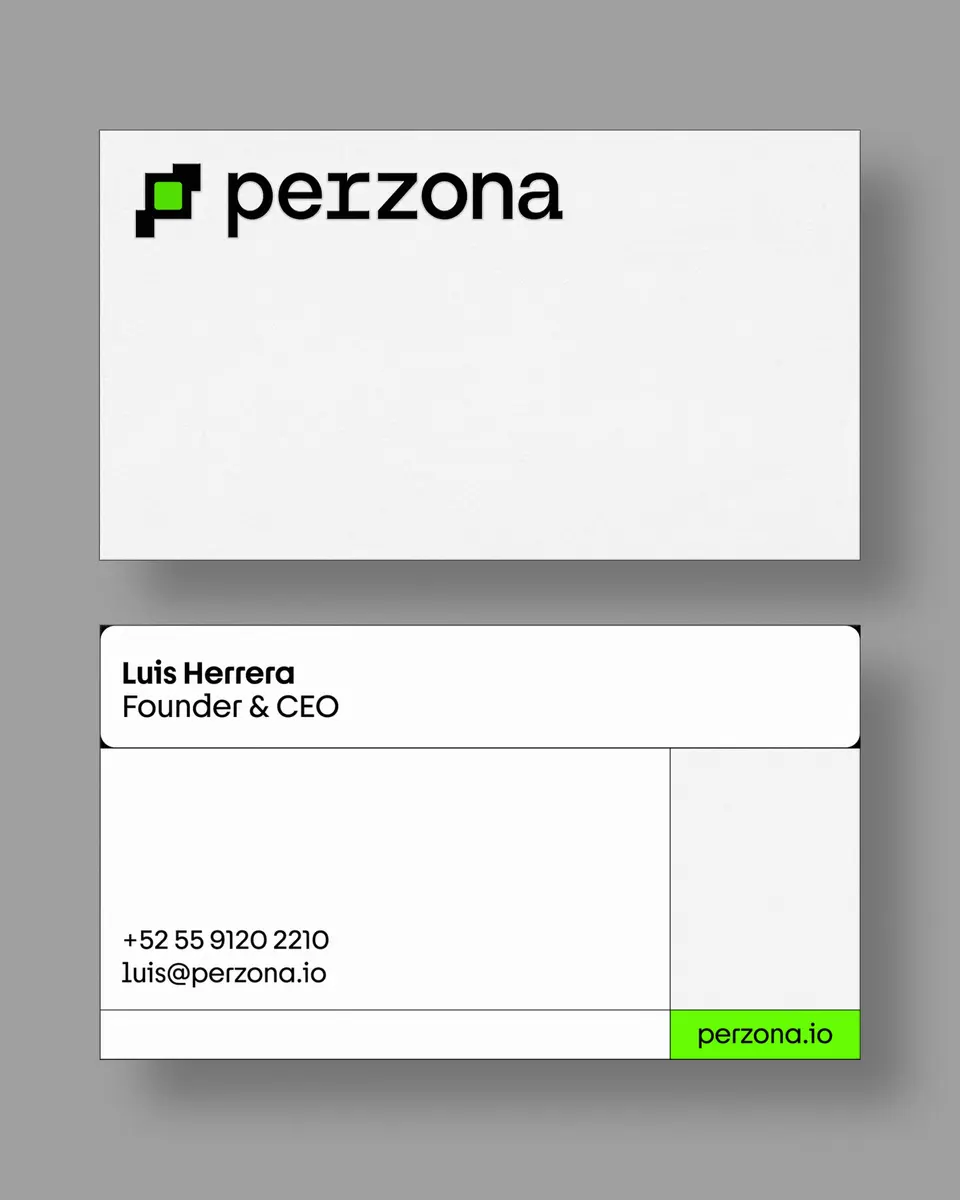
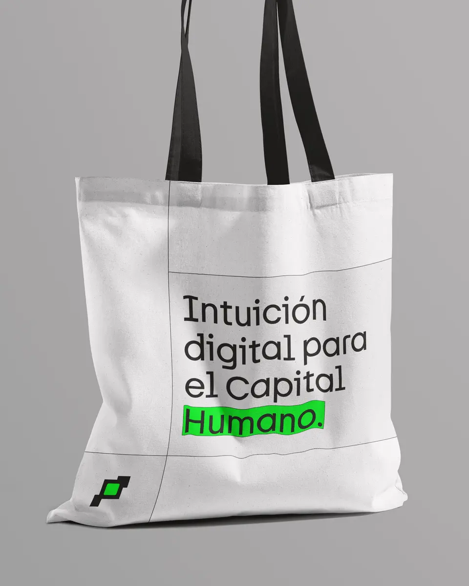
Perzona’s core colors are white and gray, which reinforce clarity, simplicity, and neutrality. When combined with black, they gain strength, innovation, and modernity. The brand’s signature neon green acts as a bold accent, signaling innovation, energy, and a vibrant Latin character. This color positions Perzona as both locally relevant and globally distinctive, setting it apart in the HR tech landscape.
PATTERS & ICONOGRAPHY
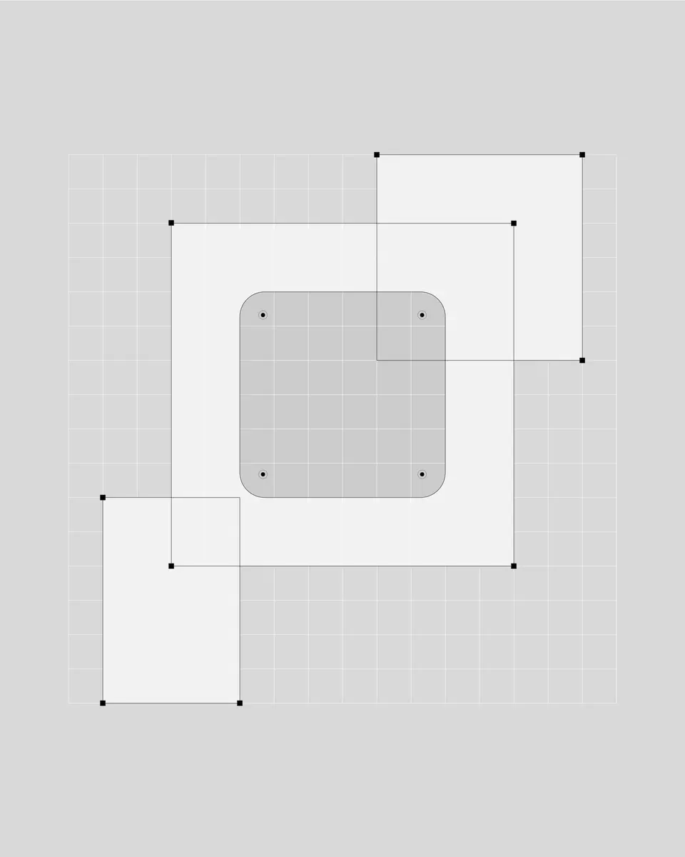
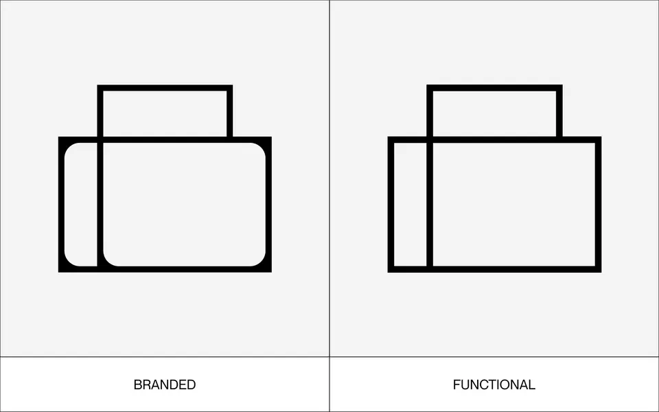
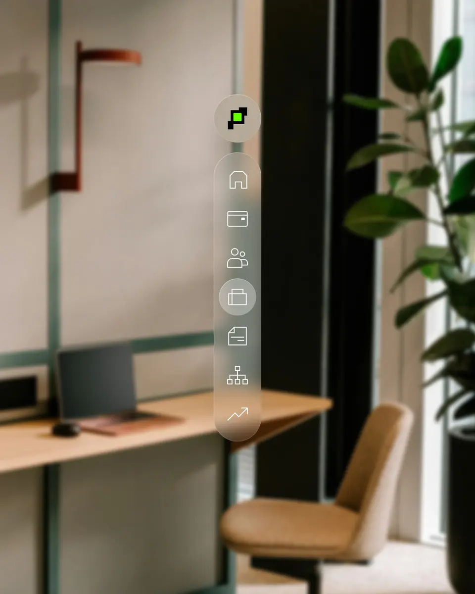
Perzona is a tech-driven company built for people, and this principle comes through in the design of its patterns and iconography. Custom icons with rounded inner corners feel approachable and human while retaining precision and systematic order. The patterns extend this concept by visually expressing organization and flow, reminding us that Perzona is not just about technology but about improving all areas of business so that people can enjoy being human even more.
ILLUSTRATION & PHOTOGRAPHY
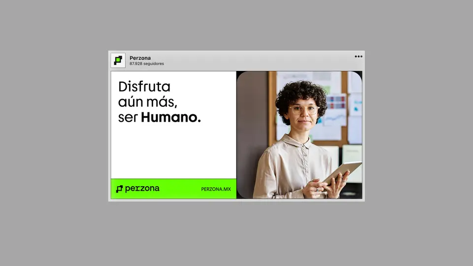
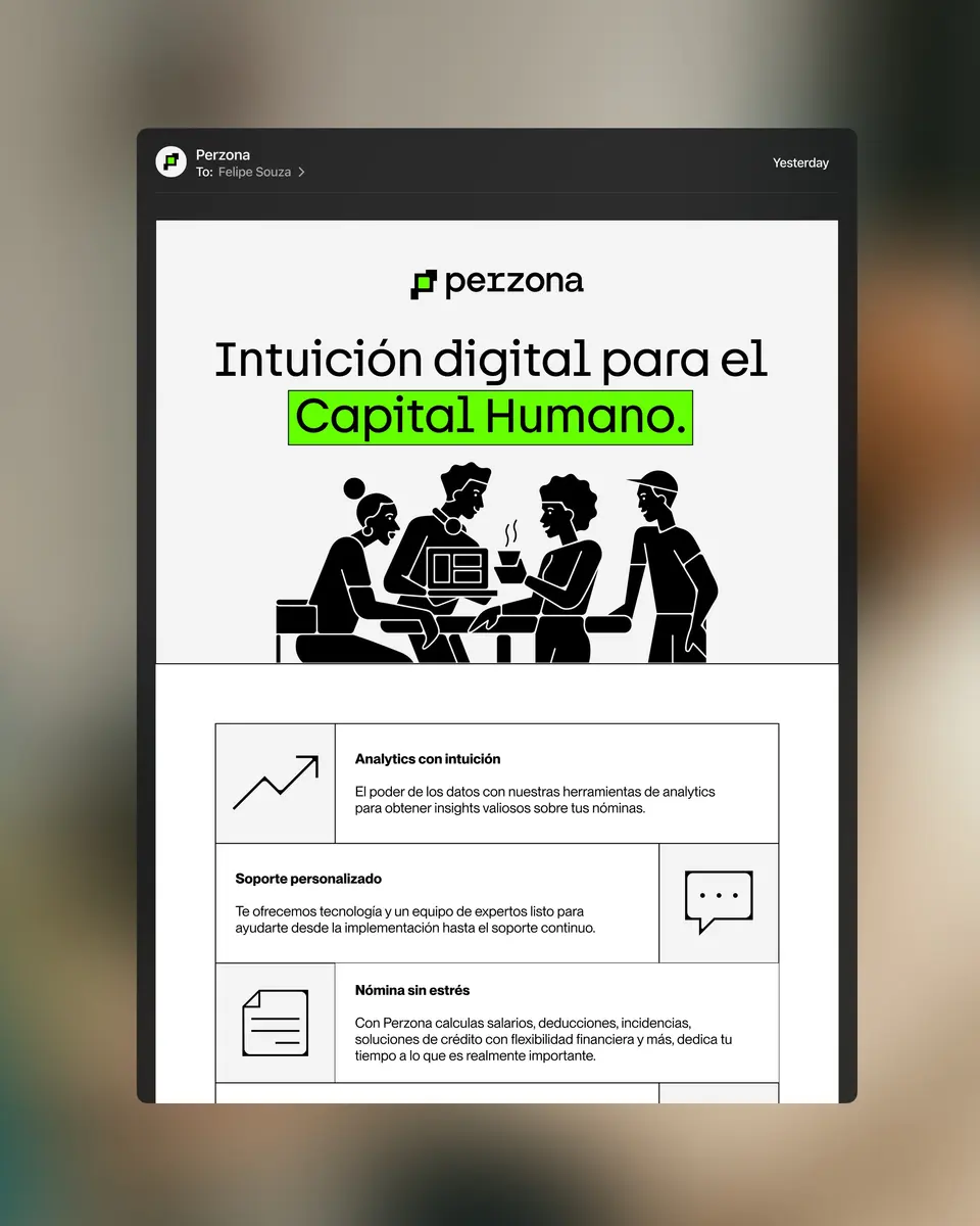
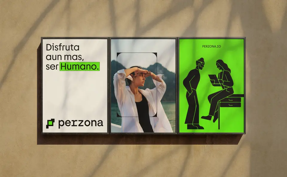
Illustration and photography are the brand’s key human connectors. Both are designed to feel relatable and approachable, portraying real people in work and life moments. The photography emphasizes relaxed environments, fewer papers and more digital tools, and confident, positive expressions. Illustrations complement this with a simple and straightforward style that communicates clarity and connection. Together, they build a visual narrative that feels direct, human, and optimistic, reinforcing Perzona’s promise of creating space for people to focus on what matters most.
CREDITS
Credits Verbal Identity: Adolfo Juárez Cacho y Ruiz Design, Motion & Market Analysis: Felipe Souza Perzona: Cesar Minero, Ruben G Agency: Data Driven Ventures Eitan Toker, Tess Michan, Sophie Gogishvili, JP Orduña
MARKET ANALYSIS
VISUAL IDENTITY
LOGO
MOTION





SAY HI →
SAY HI →
ABOUT
Perzona is a SaaS brand from Mexico that crafts meticulous, beautiful, and effective HR, payroll, and credit solutions. Its goal is simple: to remove complexity while blending accuracy with elegance. By eliminating chaos and ensuring everything is done right from the start, Perzona sets new industry standards. Through the integration of HR, payroll, and innovative credit solutions, the company provides SMEs with well-crafted, insightful, and effective tools. The focus is always on creating the best user experience in the Mexican market—an experience that is not only user-friendly but intuitive, seamless, and fully integrated. Looking forward, Perzona aims to expand across LATAM, establishing itself as a benchmark in simplicity and efficiency.
STRATEGY
Repository. Project notes for this section will return here.
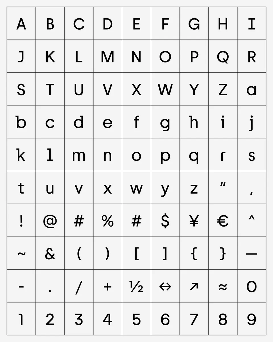
LOGO & TYPOGRAPHY
Repository. Project notes for this section will return here.
MOTION BEHAVIOR
Repository. Project notes for this section will return here.
COLORS
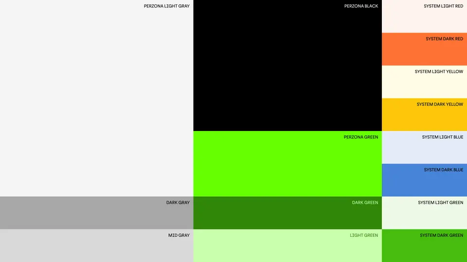
Perzona’s core colors are white and gray, which reinforce clarity, simplicity, and neutrality. When combined with black, they gain strength, innovation, and modernity. The brand’s signature neon green acts as a bold accent, signaling innovation, energy, and a vibrant Latin character. This color positions Perzona as both locally relevant and globally distinctive, setting it apart in the HR tech landscape.
PATTERS & ICONOGRAPHY
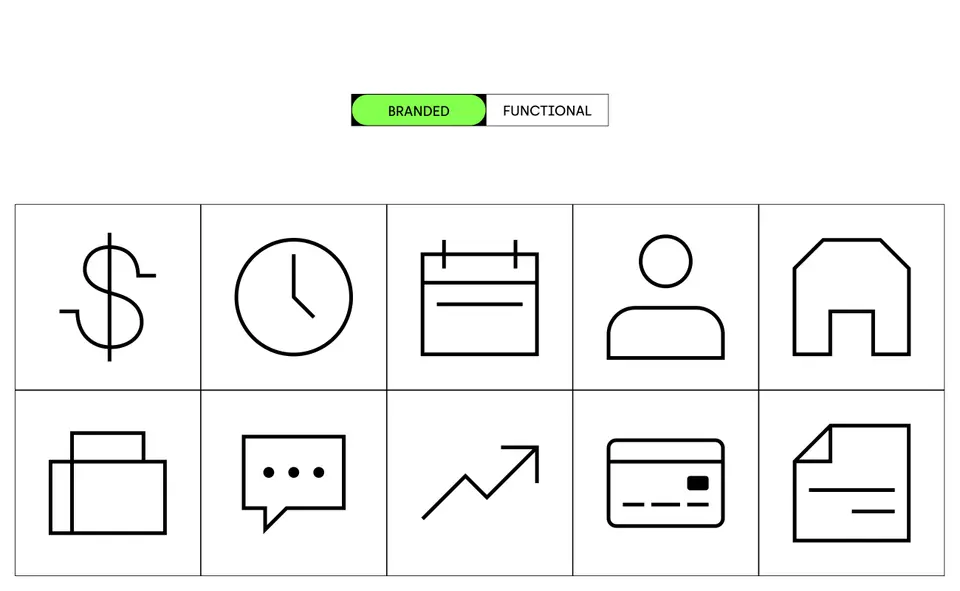
Perzona is a tech-driven company built for people, and this principle comes through in the design of its patterns and iconography. Custom icons with rounded inner corners feel approachable and human while retaining precision and systematic order. The patterns extend this concept by visually expressing organization and flow, reminding us that Perzona is not just about technology but about improving all areas of business so that people can enjoy being human even more.
ILLUSTRATION & PHOTOGRAPHY
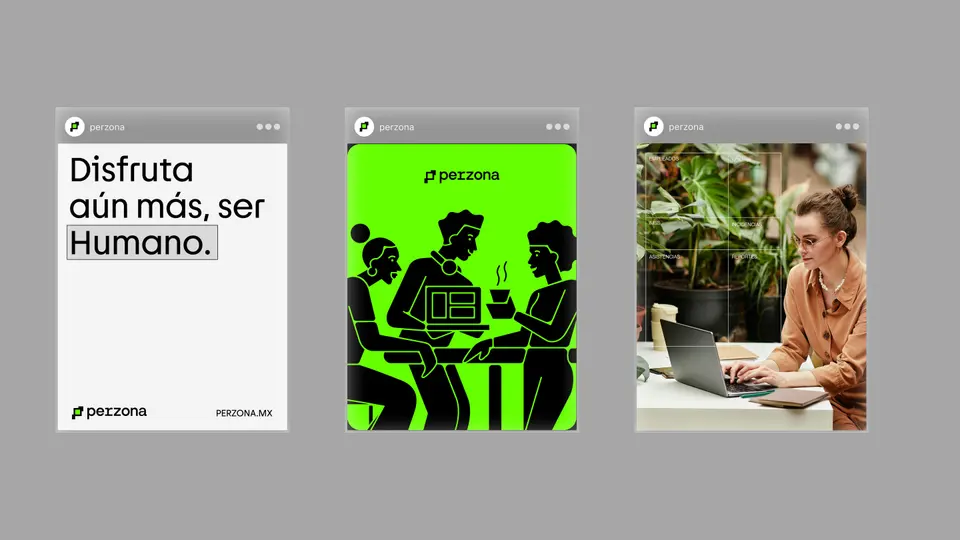
Illustration and photography are the brand’s key human connectors. Both are designed to feel relatable and approachable, portraying real people in work and life moments. The photography emphasizes relaxed environments, fewer papers and more digital tools, and confident, positive expressions. Illustrations complement this with a simple and straightforward style that communicates clarity and connection. Together, they build a visual narrative that feels direct, human, and optimistic, reinforcing Perzona’s promise of creating space for people to focus on what matters most.
CREDITS
Credits Verbal Identity: Adolfo Juárez Cacho y Ruiz Design, Motion & Market Analysis: Felipe Souza Perzona: Cesar Minero, Ruben G Agency: Data Driven Ventures Eitan Toker, Tess Michan, Sophie Gogishvili, JP Orduña
DESIGN
DESIGN
by
by
FEL
FEL